
Three brands.
One Wicked world.
Leading the digital launch across Kiss, Impress, and Falscara—with a shared story and a clear place for every collection.
Many priorities. One clear direction.
Each brand brought its own products and priorities. The challenge was to give nails and lashes balanced visibility while making the launch feel like one campaign. I led three designers across Waves 1 and 2, setting the digital direction and shaping the landing-page structure. Wave 2 brought that approach into sharper focus.
My role
Strategy
- Digital content strategy
- Brand and category hierarchy
- Landing-page structure
Direction
- Campaign art direction
- AI-assisted product imagery
- Cross-brand visual consistency
Leadership
- Digital launch coordination
- Direction of three designers
- Waves 1 and 2
Start with the world.
Then find your collection.
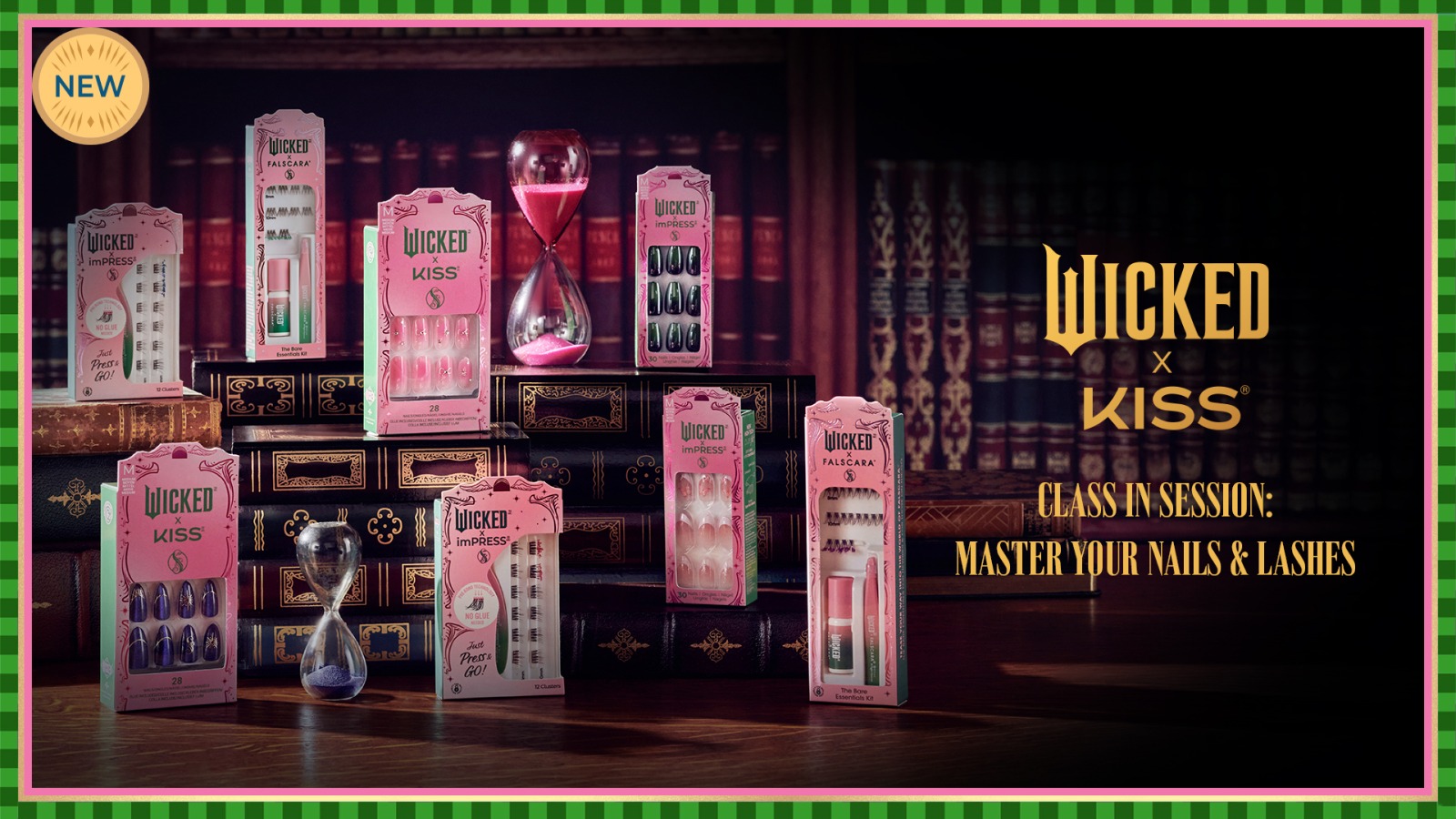
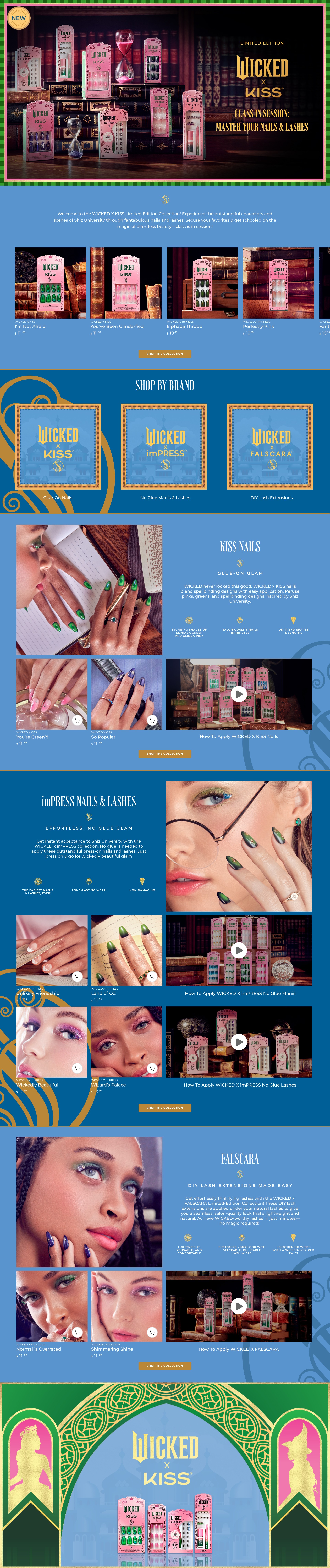
I introduced the full campaign first, then organized the experience by brand. Within each section, model imagery leads into products and application guidance. That structure gave the teams a shared approach and shoppers a clear way to explore nails and lashes.
Enter the campaign
A shared hero and collection overview establish the Wicked world.
Explore by brand
Kiss, Impress, and Falscara each have a clear entry point.
See it. Learn it. Shop it.
Model imagery, product cards, and how-to content connect inspiration with the product.
Different products.
A shared visual world.
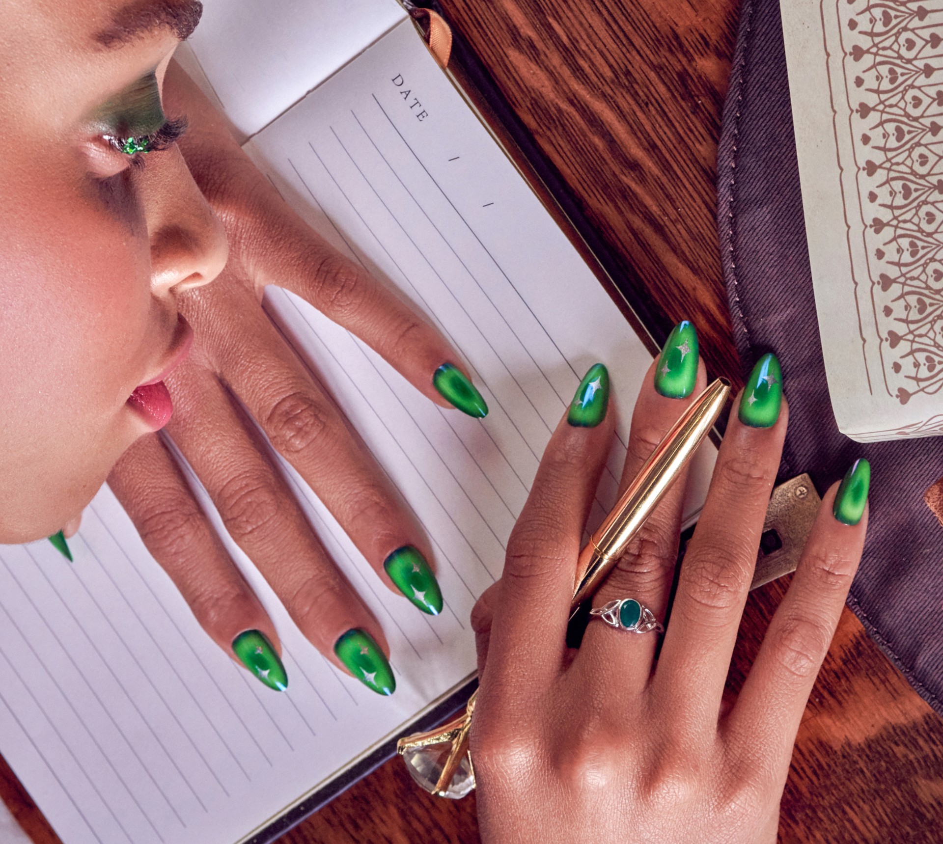
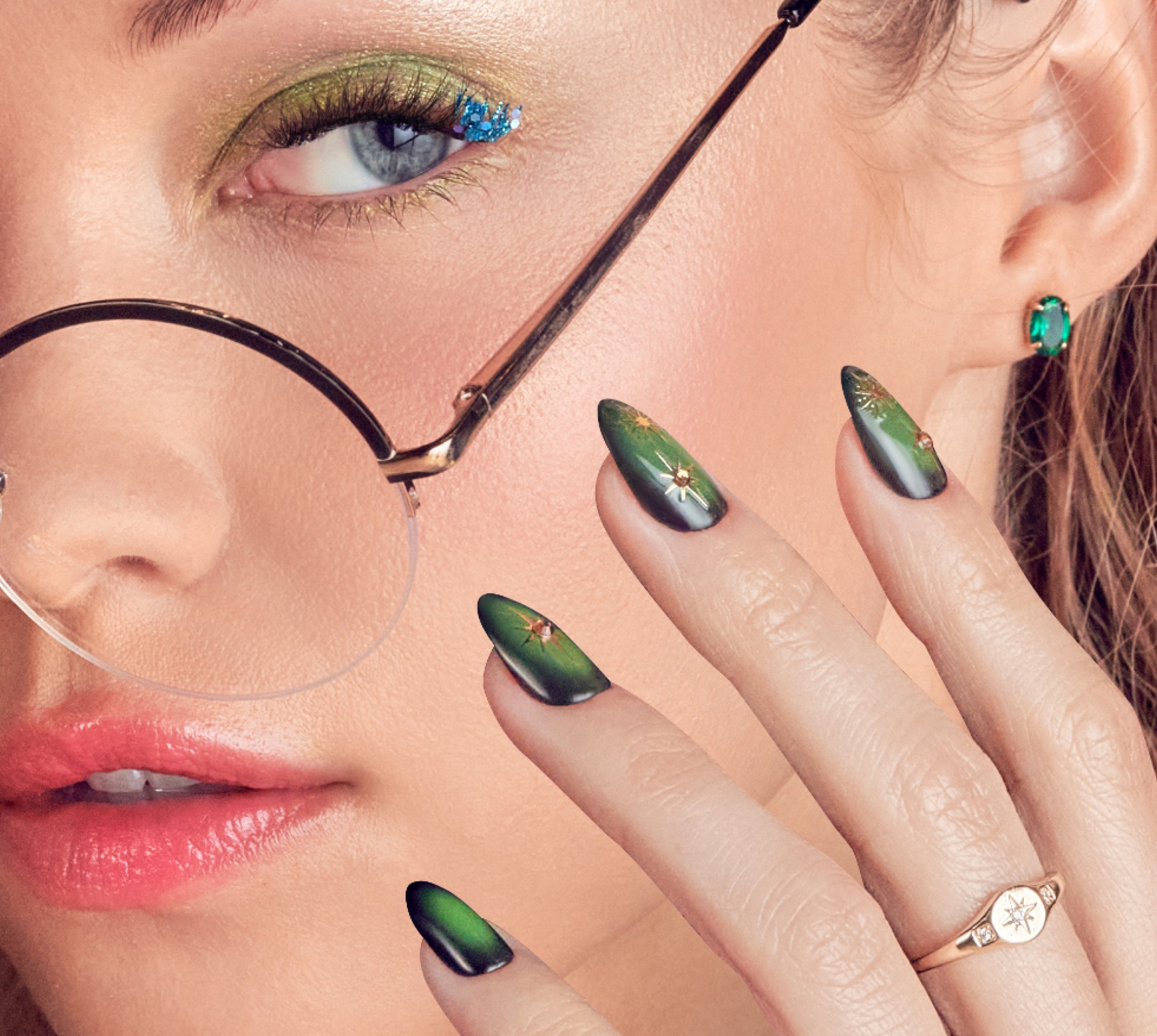
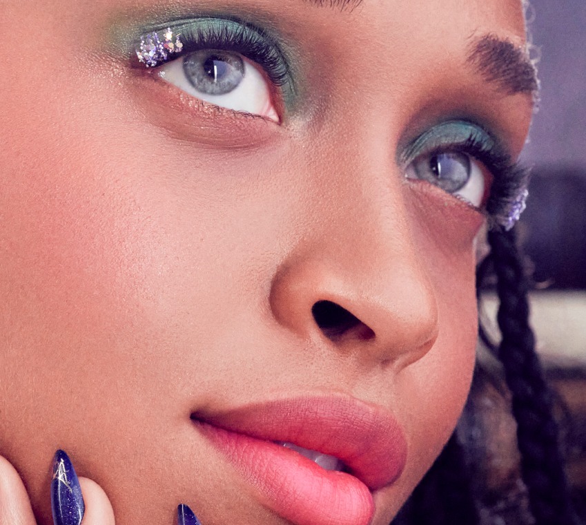
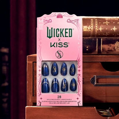
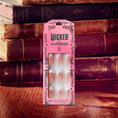
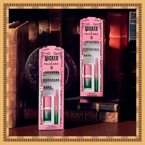
The film’s university setting gave the collections a common visual language. I aligned the mood of model imagery and product cards across brands, using AI-assisted product imagery to extend that setting. Each brand retained its identity within a consistent campaign world.
One page, with room for every brand.
On mobile, the campaign becomes a vertical journey, with horizontal product browsing and distinct entry points for each brand. Explore the mobile and desktop layouts below.

I connected the teams’ priorities through decisions people could see: the sequence of the page, the balance between categories, and a consistent visual direction across three brands.